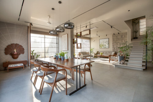
Choosing the best paint for home interior walls is one of the most important decisions when designing or renovating a house. The paint you select affects not only the look of your rooms but also durability, maintenance, lighting, and overall comfort. Whether you are repainting your entire home or refreshing a single room, selecting the right interior wall paint ensures your space looks modern, clean, and long-lasting.
The right interior paint should balance colour, finish, and durability while matching your lifestyle. From understanding paint types to choosing the correct finish and colour combinations, this guide will help you select the best paint for interior walls without confusion.
What Is Interior Wall Paint and Why It Matters?
Interior wall paint is specially designed for indoor spaces where walls face daily wear, dust, stains, and cleaning. Unlike exterior paint, which protects against weather conditions, interior paint focuses on smooth finish, washability, and maintaining indoor air quality.
High-quality interior paint improves the appearance of your home, protects walls from stains and moisture, and ensures long-term durability. Modern interior paints also come with low odour and low-VOC formulas that make them safer for families and easier to apply.
Most homeowners today prefer premium interior wall paint because it lasts longer, requires fewer coats, and maintains colour for years.
Water-Based vs Oil-Based Interior Paint
When choosing paint for home interior walls, understanding the difference between water-based and oil-based paint is essential.
Water-based paints are widely used for modern interiors. They dry quickly, produce less smell, and are easier to clean. These paints are suitable for living rooms, bedrooms, and hallways. They also resist fading and are considered the best paint for interior walls in most homes.
Oil-based paints create a harder and glossier finish. They take longer to dry and have a stronger smell, but they are more durable. Oil-based paints are often used for doors, trims, kitchens, and bathrooms where surfaces face more wear and moisture.
For most interior walls, water-based emulsion paint is the preferred option because of its smooth finish and easy maintenance.
Types of Paint for Interior Walls
Emulsion Paint
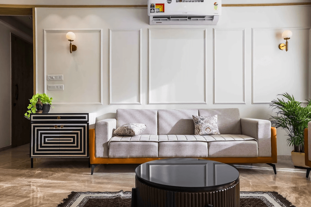
Emulsion paint is the most common and reliable choice for interior walls. It offers a smooth finish, dries quickly, and has low odour. It works well in living rooms, bedrooms, and dining areas. Emulsion paint is available in matte, satin, and glossy finishes, making it versatile for modern homes.
It is also resistant to mild stains and can be cleaned easily, making it ideal for families and everyday living spaces.
Enamel Paint
Enamel paint provides a hard and glossy surface. It is highly durable and resistant to stains and moisture. This type of paint is often used in kitchens, bathrooms, and on doors or trims because it can handle frequent cleaning and splashes.
Although enamel paint is not commonly used on full walls, it is useful for high-traffic surfaces.
Distemper Paint
Distemper paint is a budget-friendly option for interior walls. It provides a soft matte finish and is usually used for ceilings or low-traffic areas. While it is economical, it is less durable than emulsion paint and may require repainting sooner.
Distemper works best in spaces that do not require frequent cleaning.
Texture Paint
Texture paint adds depth and design to walls. It is commonly used for feature walls in living rooms or bedrooms. Textured finishes can hide minor wall imperfections and create a unique visual effect.
Many modern homes use texture paint on one wall while keeping the rest neutral.
Metallic or Designer Paint
Metallic or designer paints create a premium look and are often used for accent walls. These paints reflect light and add a luxurious feel to modern interiors. They are usually used in living rooms, dining areas, or home offices for visual impact.
How to Choose the Best Paint for Your Interior Walls?
Choosing the best paint for interior walls involves more than selecting a colour. It requires understanding how each room is used and what type of finish will perform best.
Consider Room Function
Each room has different needs. Living rooms and bedrooms require smooth, elegant finishes, while kitchens and bathrooms need moisture-resistant and washable paint. Hallways and kids’ rooms benefit from durable and stain-resistant paint.
Selecting paint based on room usage ensures longer durability and easier maintenance.
Select the Right Paint Finish
Paint finish determines how shiny or matte the wall appears and how easy it is to clean.
Matte finish provides a smooth, non-shiny look and hides wall imperfections. It works best in bedrooms and low-traffic areas.
Satin or eggshell finish offers a soft sheen and is easier to clean, making it ideal for living rooms and dining areas.
Semi-gloss finish is more durable and moisture-resistant, making it suitable for kitchens and bathrooms.
Gloss finish is highly reflective and is mainly used for doors, trims, and cabinets.
Choosing the correct finish helps maintain the look of your interior walls over time.
Choose the Right Colour
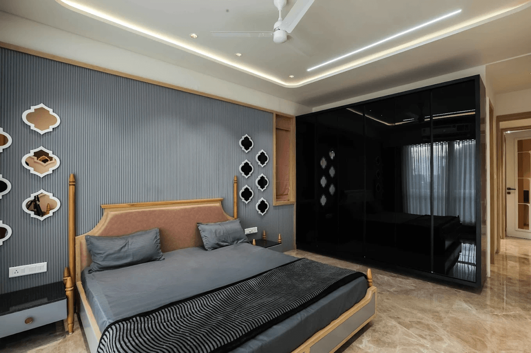
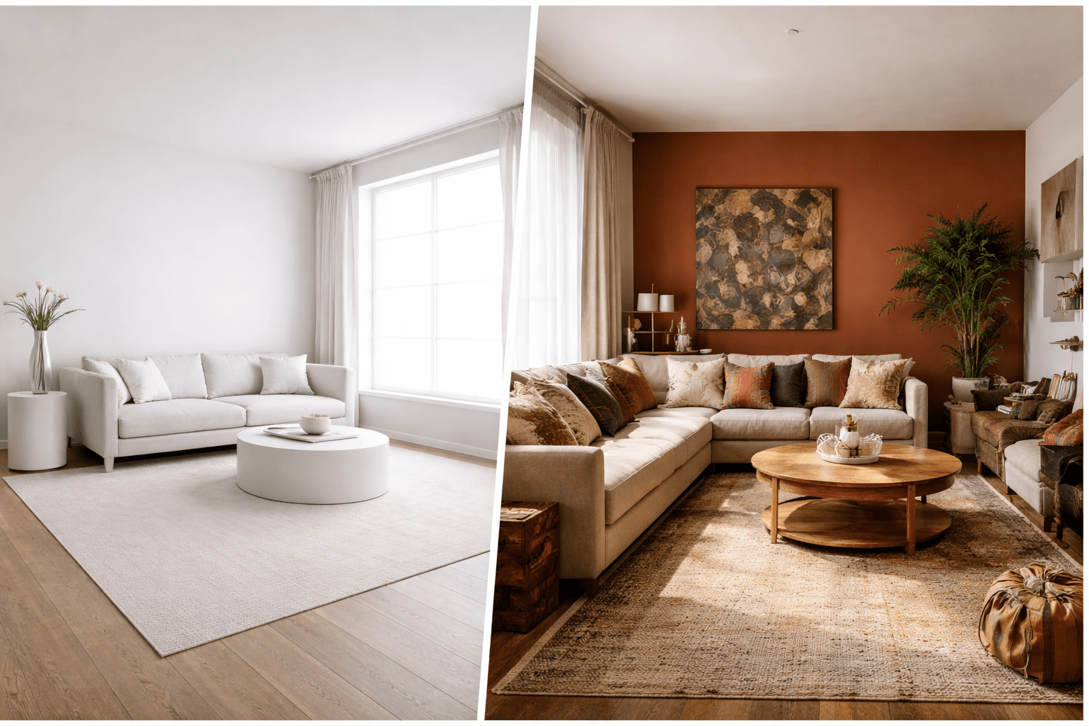
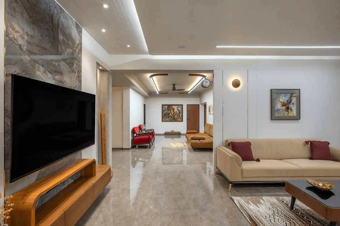
Interior wall colour influences mood, lighting, and space perception. Light colours such as warm white, beige, and soft grey make rooms feel larger and brighter. Darker colours like navy or charcoal can be used as accent walls to add depth.
Before finalising a colour, always test a small sample on the wall. Lighting conditions can change how the colour appears during the day and night.
Check Durability and Washability
The best paint for home interior walls should be washable and resistant to stains. Homes with children or pets require paint that can handle regular cleaning without fading or peeling.
Investing in high-quality paint reduces long-term maintenance and repainting costs.
Look for Low-VOC Paint
Low-VOC interior paints are safer for indoor air quality and produce less smell. They are recommended for bedrooms and homes with children or elderly residents.
These paints create a healthier living environment while maintaining durability.
Best Paint Colours for Interior Walls
Choosing the right colour combination helps create balance in your home. Neutral colours remain the most popular for modern interiors because they match different furniture styles and décor themes.
Warm white and beige create a bright and welcoming space. Soft grey gives a modern and sophisticated look. Light blue and pastel green work well in bedrooms for a calm environment. Deep blue or charcoal can be used on feature walls to add contrast.
Using two-tone colour combinations, such as three neutral walls with one accent wall, adds visual interest without overwhelming the space.
Living Room Wall Colour Ideas Based on Space and Light
Choosing living room paint colours isn’t just about personal preference — the size of your room and the amount of natural light it receives play a crucial role in making the space feel comfortable, inviting, and well-balanced. Here’s how you can decide the right shades based on your living room’s space and lighting conditions:
1. Small Living Rooms
For compact spaces, lighter shades such as soft beige, off-white, pale grey, or pastel tones can make the room feel more spacious and airy.
Tip: Pair these colours with reflective surfaces, mirrors, or metallic accents to enhance the illusion of depth.
2. Large Living Rooms
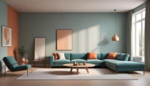
Bigger living rooms can handle bold and deeper shades like navy blue, forest green, or rich terracotta. These colours create warmth and intimacy in otherwise expansive spaces.
Tip: Use feature walls in darker shades while keeping the rest of the room lighter to maintain balance.
3. Naturally Bright Living Rooms
If your living room gets plenty of sunlight, you can experiment with both warm and cool tones. Cool shades like soft blues, mint green, or grey work well to balance brightness, while warmer tones such as mustard or terracotta add vibrancy.
Tip: Avoid overly dark colours in sunlit rooms, as they may create harsh contrasts.
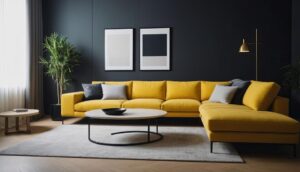
4. Dimly Lit Living Rooms
Rooms with limited natural light benefit from bright and reflective colours. Shades like creamy white, warm beige, light peach, or soft yellows can help make the space feel cheerful and inviting.
Tip: Use strategically placed lighting and mirrors to amplify the brightness of these shades.
5. Harmonizing With Furniture and Décor
Consider your existing furniture, flooring, and décor while choosing colours. For instance:
- Neutral walls complement modern and minimalist furniture.
- Earthy walls pair beautifully with wooden elements and rustic décor.
- Bold accent walls can highlight statement furniture or art pieces.
By analyzing space, lighting, and interior elements, you can select interior wall colour ideas for living room that not only look appealing but also enhance functionality, mood, and comfort.
| Room Size & Lighting | Suggested Wall Colour | Mood & Effect | Pairing Ideas |
|---|---|---|---|
| Small & Low Light | Light Beige, Soft Cream | Brightens the space, creates airy feel | Light wood furniture, white or pastel décor |
| Small & Natural Light | Pale Grey, Soft Pastel Blue | Modern yet cozy, enhances natural light | Minimalist furniture, metallic accents |
| Medium & Bright Light | Warm Taupe, Peach, Terracotta | Adds warmth without overpowering | Wooden furniture, earthy textures |
| Large & Bright Light | Navy Blue, Forest Green, Deep Grey | Creates drama and elegance | Neutral furniture, gold/brass accents |
| Large & Low Light | Light Grey, Soft White, Warm Beige | Prevents dark, gloomy look, opens space | Mirrors, light furniture, reflective surfaces |
| Natural & Earthy Theme | Olive Green, Terracotta, Sand | Connects interior with nature, calming | Woven textiles, indoor plants, rustic furniture |
Best Wall Paint Colour Combinations for Living Room
Ready to explore some color options? Here are my favorite color combinations that not only look fabulous but also suit Ahmedabad homes beautifully.
1. Beige and Teal for a Relaxing Oasis
If you love calm, contemporary interiors, beige and teal make a flawless match. Beige provides a versatile, neutral base that complements any interior style, while teal adds just the right touch of freshness and sophistication.
This combination works beautifully in Indian homes as it balances the warmth of natural sunlight with a cool, breezy vibe. Beige walls keep the space light and airy, while teal can be introduced through accent walls, cushions, curtains, or decor pieces for visual interest.
- Why it works well: It creates a relaxed and soothing mood while maintaining a modern, elegant look.
- Pro tip: Use matte or eggshell finishes for beige walls and a slightly glossy finish for teal accents to enhance depth and light reflection.
2. Grey and Mustard for Modern Elegance
For a more dynamic and urban aesthetic, the pairing of grey and mustard offers sophistication with a hint of playfulness. Grey’s neutral tone makes an excellent canvas for art and lighting, while mustard adds energy, optimism, and cultural warmth — a nod to India’s traditional colour palette.
This combination works best in living rooms that aim for a modern yet cozy atmosphere. The subtle contrast also helps highlight architectural features like niches or statement furniture.
- Why it works well: It brings together cool and warm tones for visual harmony, creating depth without overwhelming the space.
- Pro tip: Use soft grey on the main walls and mustard on smaller accent walls or décor items like cushions, rugs, or armchairs.
3. Navy Blue and White for a Classic Touch
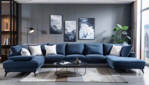
A timeless favourite, navy blue and white bring elegance and simplicity together in one stunning combination. White reflects light and visually enlarges your space, while navy blue adds richness, making it ideal for both traditional and modern living rooms.
This duo is perfect for homes that want a classy yet inviting feel. You can use navy on one statement wall or in furniture and fabrics while keeping the rest of the space crisp white for balance.
- Why it works well: The high contrast enhances sophistication while maintaining a clean, balanced aesthetic.
- Pro tip: Add metallic accents like silver or chrome, and layer white fabrics to keep the room light and open.
4. Earthy Tones (Terracotta and Olive Green)
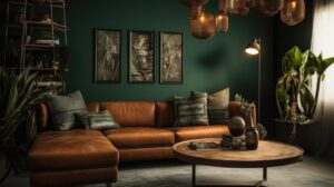
Rooted in earthy tones, terracotta and olive green bring a natural and organic vibe to your living room. Terracotta introduces rustic warmth, while olive green brings calmness and connection to nature.
This palette works wonderfully for homes with wooden furniture, textured fabrics, or handcrafted décor. It’s ideal for Indian households that appreciate traditional aesthetics blended with modern sensibility.
- Why it works well: Both colours ground the space while keeping it cozy and visually rich.
- Pro tip: Combine this palette with woven baskets, clay pots, indoor plants, and jute rugs for an effortlessly earthy interior.
FAQs
Can interior paint be applied during the rainy season?
Yes, interior paint can be applied during the rainy season if humidity inside the house is controlled. For best results, keep windows closed during heavy moisture, use a dehumidifier or air conditioner, and ensure walls are completely dry before painting. Modern interior wall paints dry well when indoor humidity is low, even during monsoon months.
Can you use spray paint with stencils for interior wall painting?
Yes, spray paint with stencils can be used for interior wall painting to create patterns, textures, or feature wall designs. It works best on smooth primed walls and is commonly used for modern accent walls, kids’ rooms, and decorative interior designs. Always use low-odour interior spray paint and protect surrounding areas before spraying.
How long does interior paint last on walls?
High-quality interior wall paint typically lasts 5 to 7 years on average. Premium emulsion paints can last even longer if walls are properly primed and maintained. Kitchens, bathrooms, and high-traffic areas may require repainting sooner due to stains, moisture, and daily wear.
How many times can you paint an interior wall?
Interior walls can be repainted multiple times, but excessive layers without proper sanding and primer can lead to uneven surfaces. For best results, professionals recommend sanding old paint and applying primer before repainting to ensure smooth finish and long-lasting results.
What is the best temperature to paint interior walls?
The best temperature to paint interior walls is between 18°C and 30°C. This temperature range allows paint to dry evenly and prevents cracking or patchy finish. Avoid painting in extreme humidity or very cold conditions, as this can affect paint adhesion and drying time.
How to prepare a room for interior painting?
To prepare a room for interior painting, remove furniture or cover it with sheets, clean walls to remove dust and grease, fill cracks or holes with putty, sand the surface, and apply primer. Proper wall preparation ensures smooth paint finish, better colour coverage, and longer durability.
Which type of paint is best for interior walls?
Water-based emulsion paint is considered the best paint for interior walls because it is durable, washable, low-odour, and long-lasting. It provides a smooth finish and works well in living rooms, bedrooms, and hallways. Semi-gloss or satin paints are better for kitchens and bathrooms.
Which is the best paint for home interior walls in India?
The best paint for home interior walls in India is premium washable emulsion paint that is moisture-resistant, stain-resistant, and low-VOC. These paints are suitable for Indian weather conditions and offer long-lasting colour and easy maintenance for modern homes.
How do I choose good quality paint?
To choose good quality interior paint, check for washability, stain resistance, coverage per litre, low VOC levels, and durability. Premium paints may cost more initially but require fewer coats and last longer, making them more cost-effective over time.
How do you test paint quality?
Paint quality can be tested by checking thickness, coverage, and finish after drying. Apply a small sample on the wall and see how well it spreads, how quickly it dries, and whether it resists stains after cleaning. Good interior paint provides smooth coverage and does not fade quickly.
What type of paint is used for interior walls?
Emulsion paint is the most commonly used paint for interior walls because it offers a smooth finish, low odour, and easy maintenance. Matte, satin, and semi-gloss finishes are selected depending on the room type and durability requirements.
You have not enough Humanizer words left. Upgrade your Surfer plan.
![Hotel Interior Designer in Ahmedabad [2026 Cost Guide]](https://ahmedabadinteriordesigner.in/wp-content/uploads/2026/03/Hotel-Interior-Designer-in-Ahmedabad.png)